Permenantly Closed
There’s a particular kind of sadness that comes with pulling up a café on Naver Maps only to find the dreaded “permanently closed” notice staring back at you. Diver Chu! Churros Store in Seongsu-dong is one of those places — a spot so visually committed, so fully realized as a concept, that its disappearance feels less like a business closure and more like a small piece of Seoul’s ongoing identity experiment quietly going under.
I’m glad I got there in time.
Dive Into You, Bite Sweet
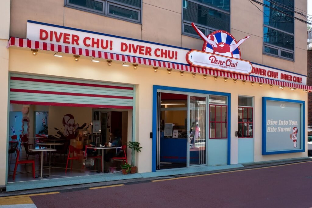
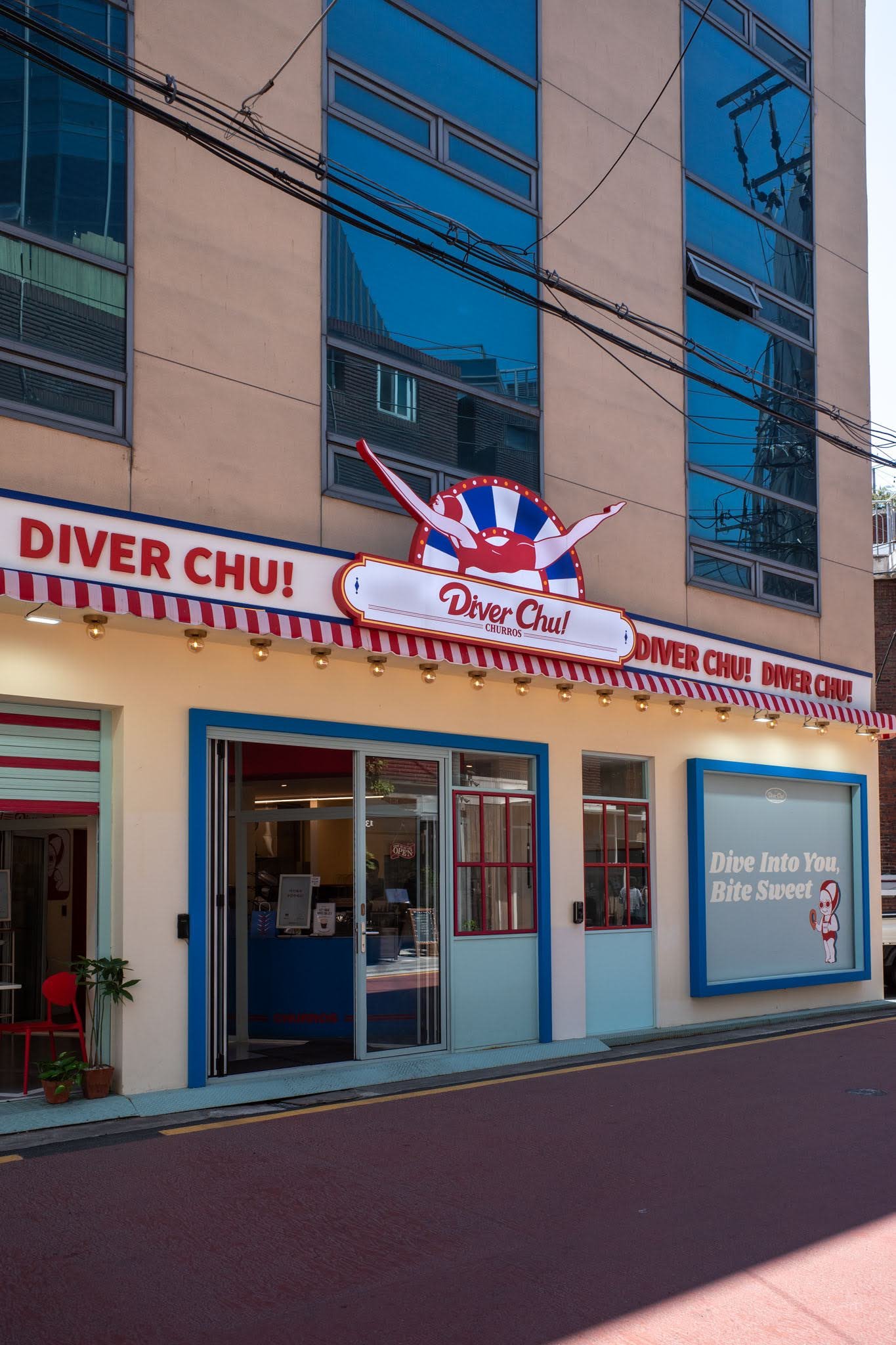
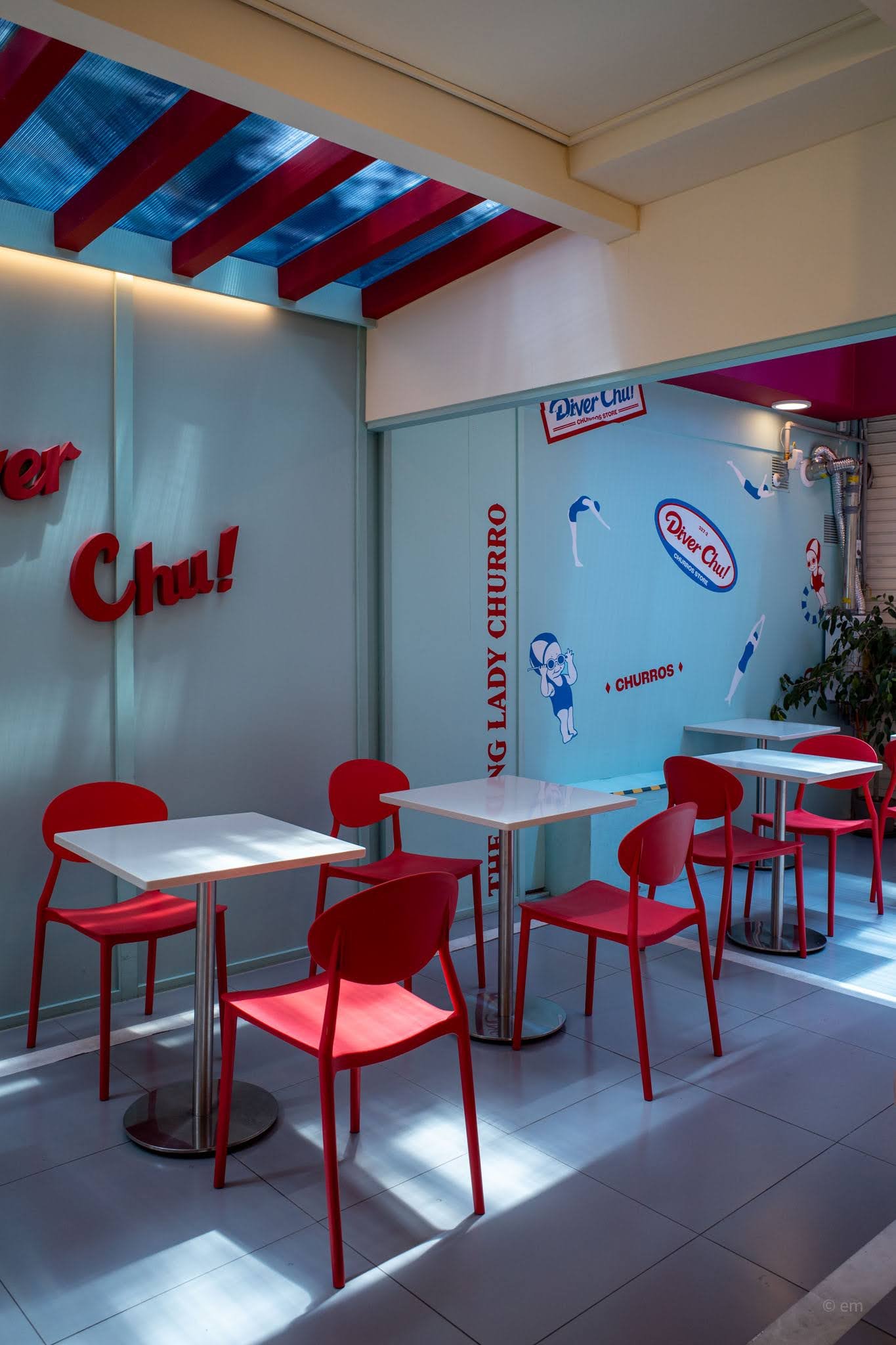
The storefront alone was enough to stop you mid-stride. A red-and-white striped awning ran the full width of the building, ringed with warm marquee bulbs in the style of a 1950s American carnival or drive-in theater. Above the entrance, a large circular sign featured the brand’s mascot — a woman in a red swimsuit, arms outstretched mid-dive — framed by a starburst of red, white, and blue. The words “DIVER CHU! DIVER CHU!” scrolled across the fascia in bold red capitals, and a window panel to the right declared the café’s tagline in confident retro lettering: Dive Into You, Bite Sweet.
It was the kind of exterior that didn’t ask permission. You either got it immediately, or you walked on by. Most people stopped.
Inside the Pool
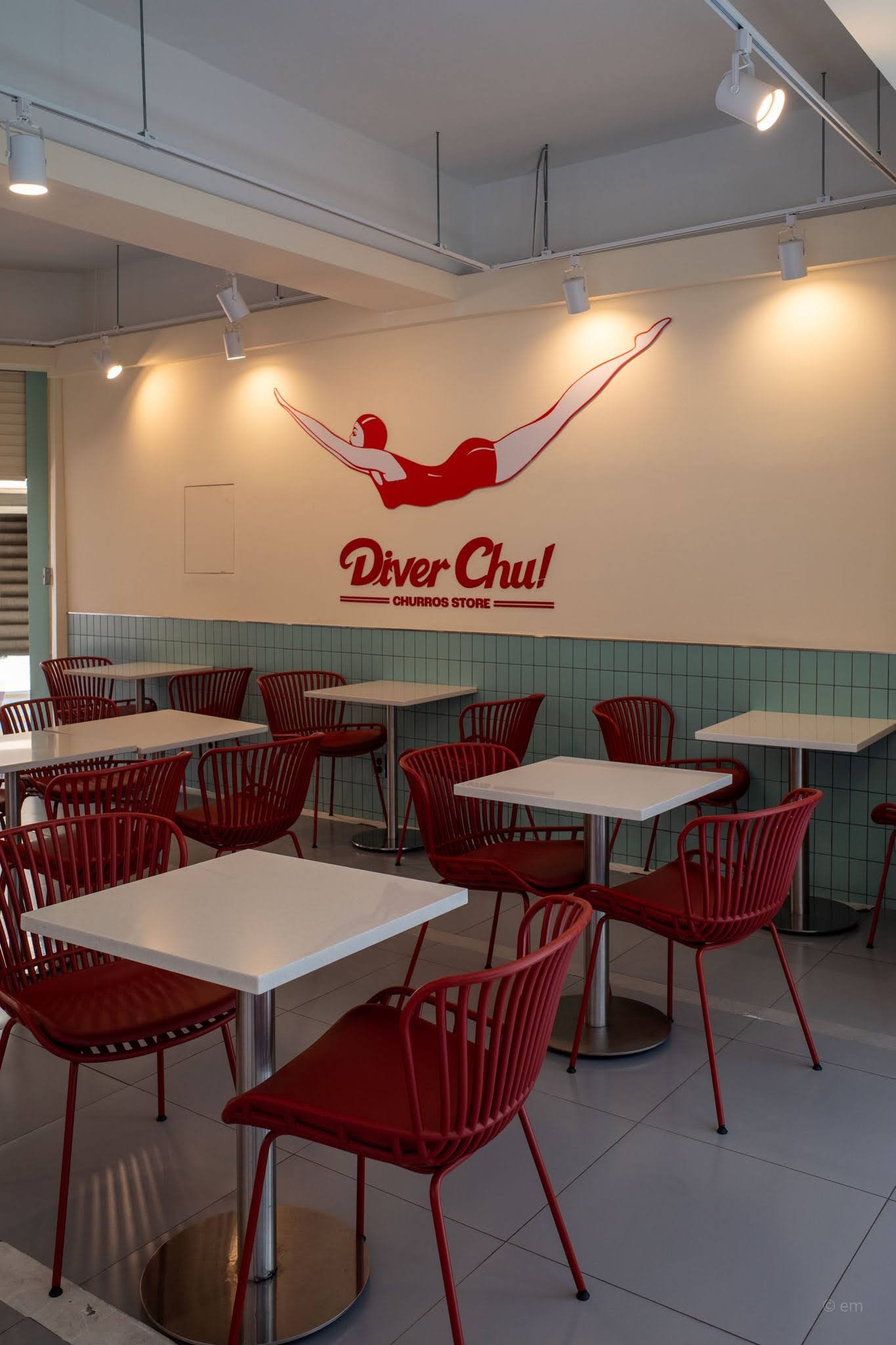
Stepping through the sliding glass doors felt like entering a very specific, very deliberate fantasy — somewhere between a mid-century American diner, a public swimming pool, and a Korean dessert café trying hard (successfully) to be a whole thing.
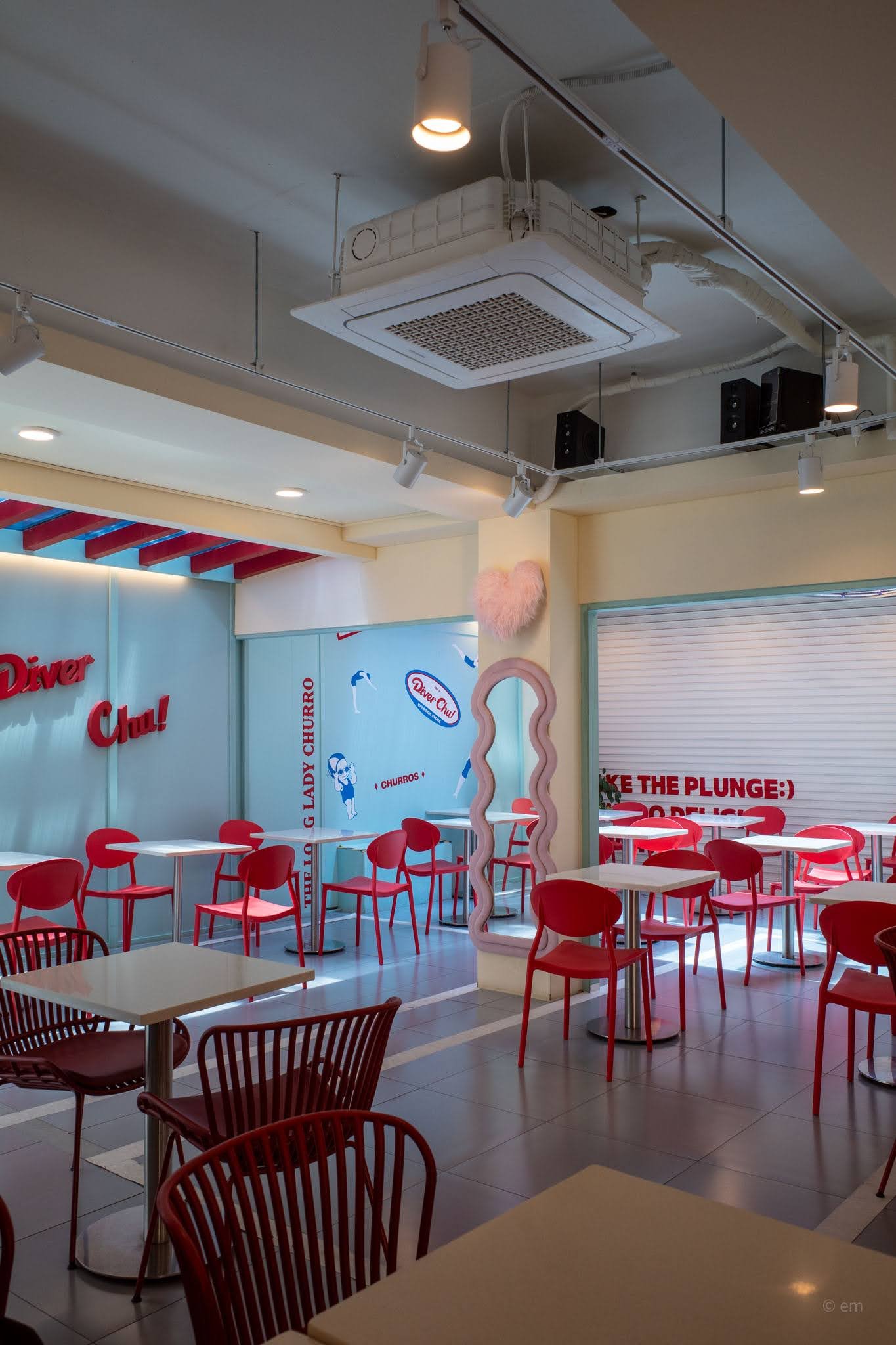
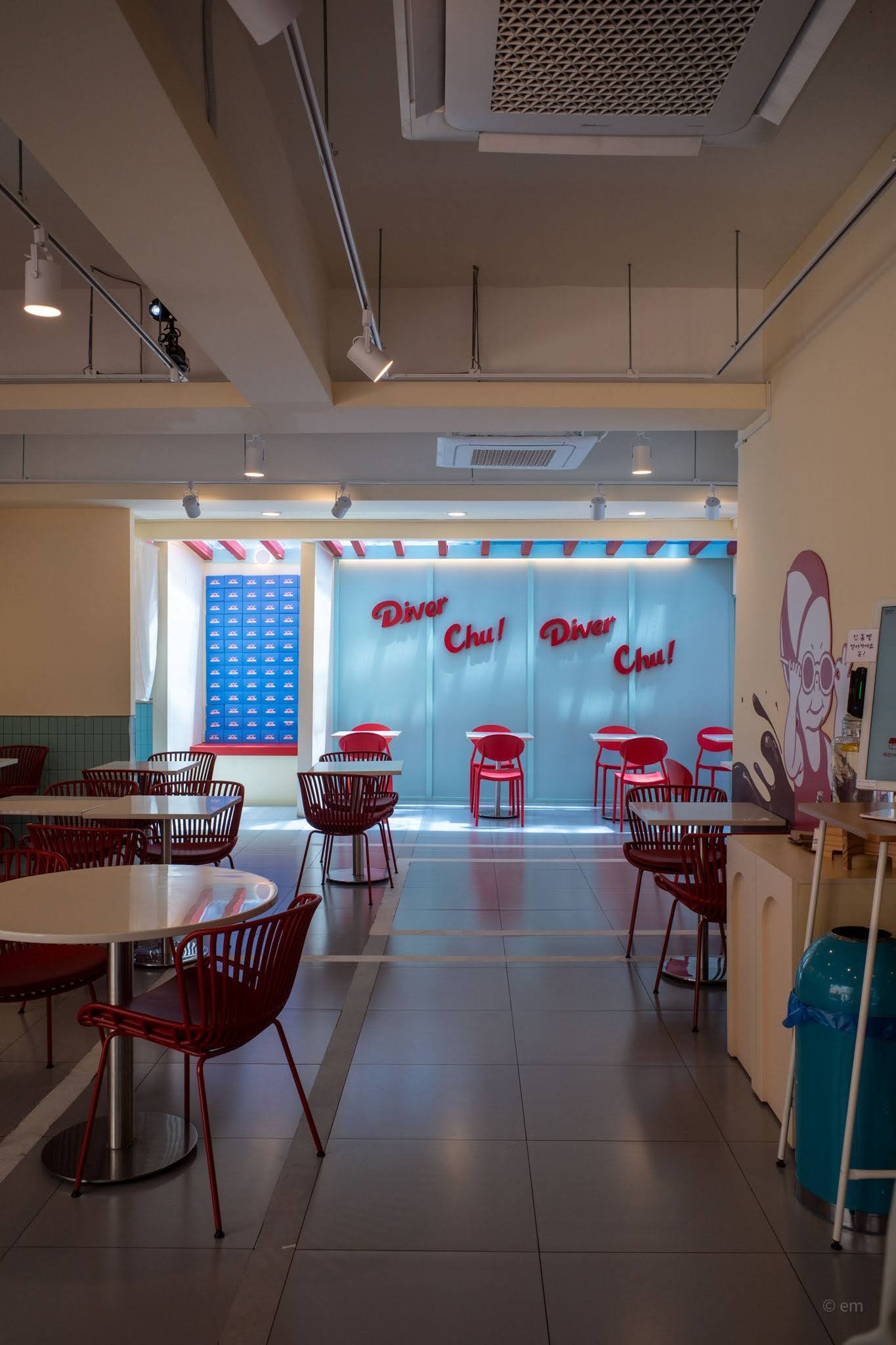
The main dining room greeted you with cream-colored walls and mint-green subway tiles along the lower half, the kind of institutional tile you’d find in a real swimming pool locker room. Red wire-frame chairs — open, almost sculptural — were paired with white round or square tables on brushed steel pedestals. The floor was pale grey tile, cool and clean. Track lighting overhead threw warm pools of light across the space without pretending it was anything other than what it was: a designed environment, joyfully artificial.
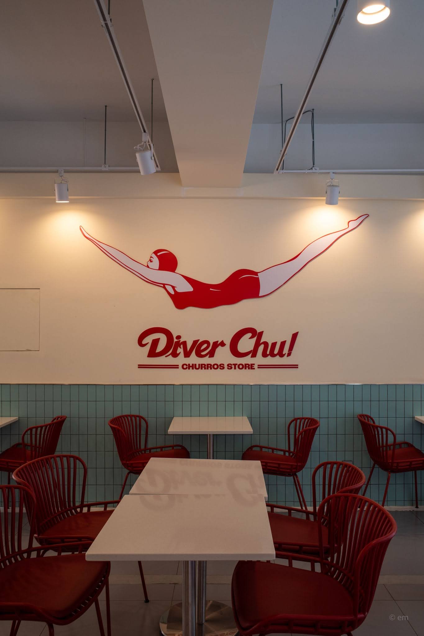
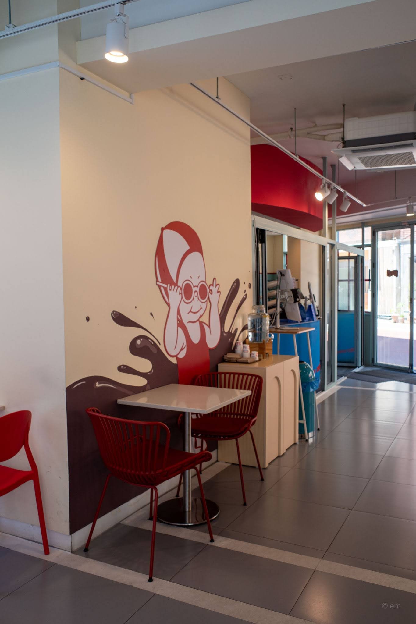
The brand’s diver mascot — that elongated, elegant figure in a red one-piece — appeared large on the main wall, silk-screened in flat red and white, arms spread wide as if about to break the surface. Below her, simply: Diver Chu! Churros Store.
Rooms Within the Pool
The space was deeper than it first appeared, unfolding through different zones as you moved further in.
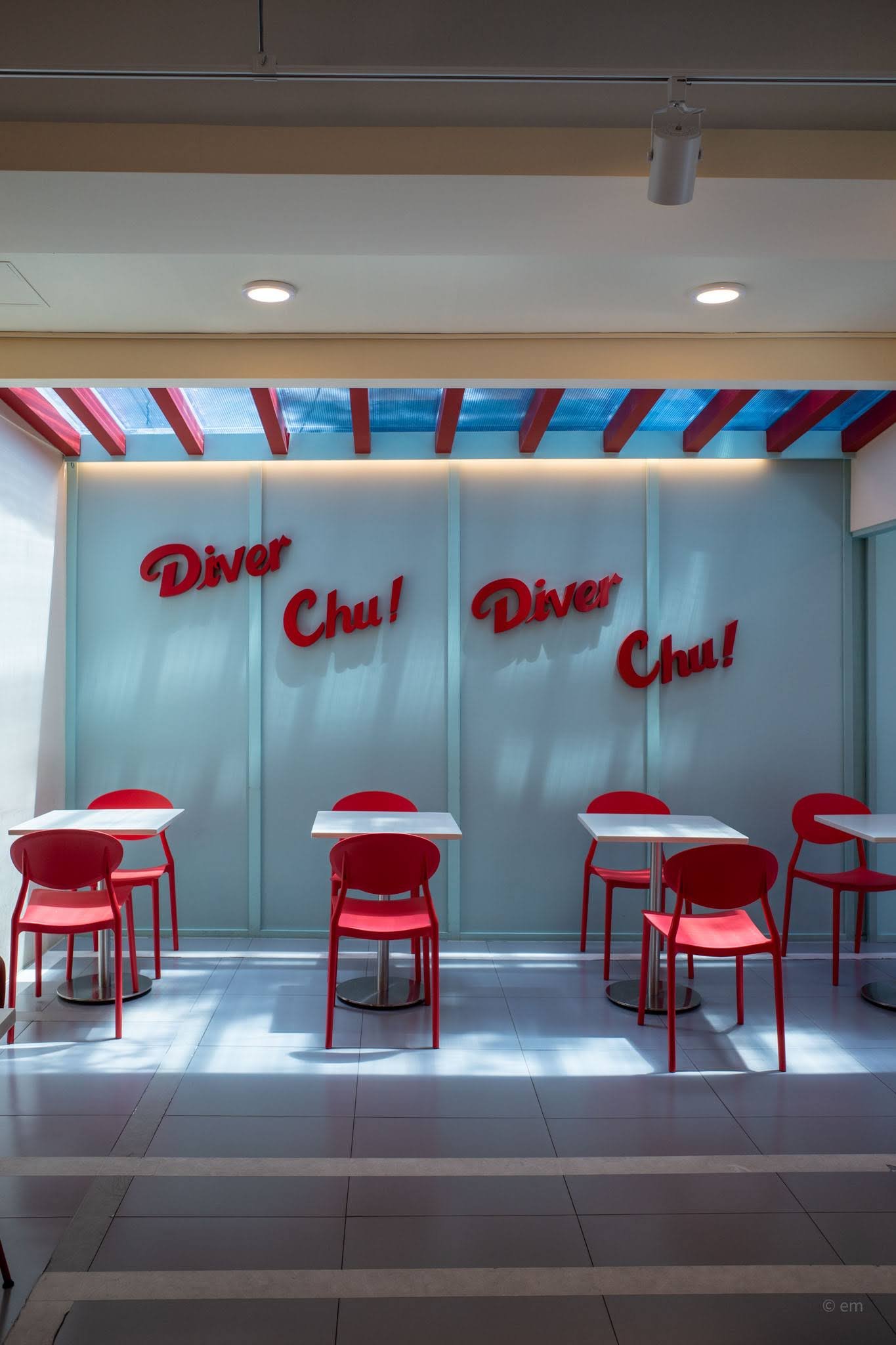
A back area opened up under a dramatic skylight ceiling of translucent blue corrugated panels, striped through with bold red beams — the effect was exactly like looking up from the bottom of a swimming pool, sunlight filtering through rippling water above. Red 3D lettering spelling Diver Chu! was mounted on frosted glass panels that glowed with soft backlit warmth. It was the kind of detail that made you understand why people came here specifically to take photographs.
One wall in this section was painted in a cool aqua blue and illustrated with flat graphic figures of divers mid-leap, along with the brand logo and the phrase “The Long Lady Churro” running vertically down the wall — a nod, presumably, to the long churro itself, cast as some kind of athletic champion.
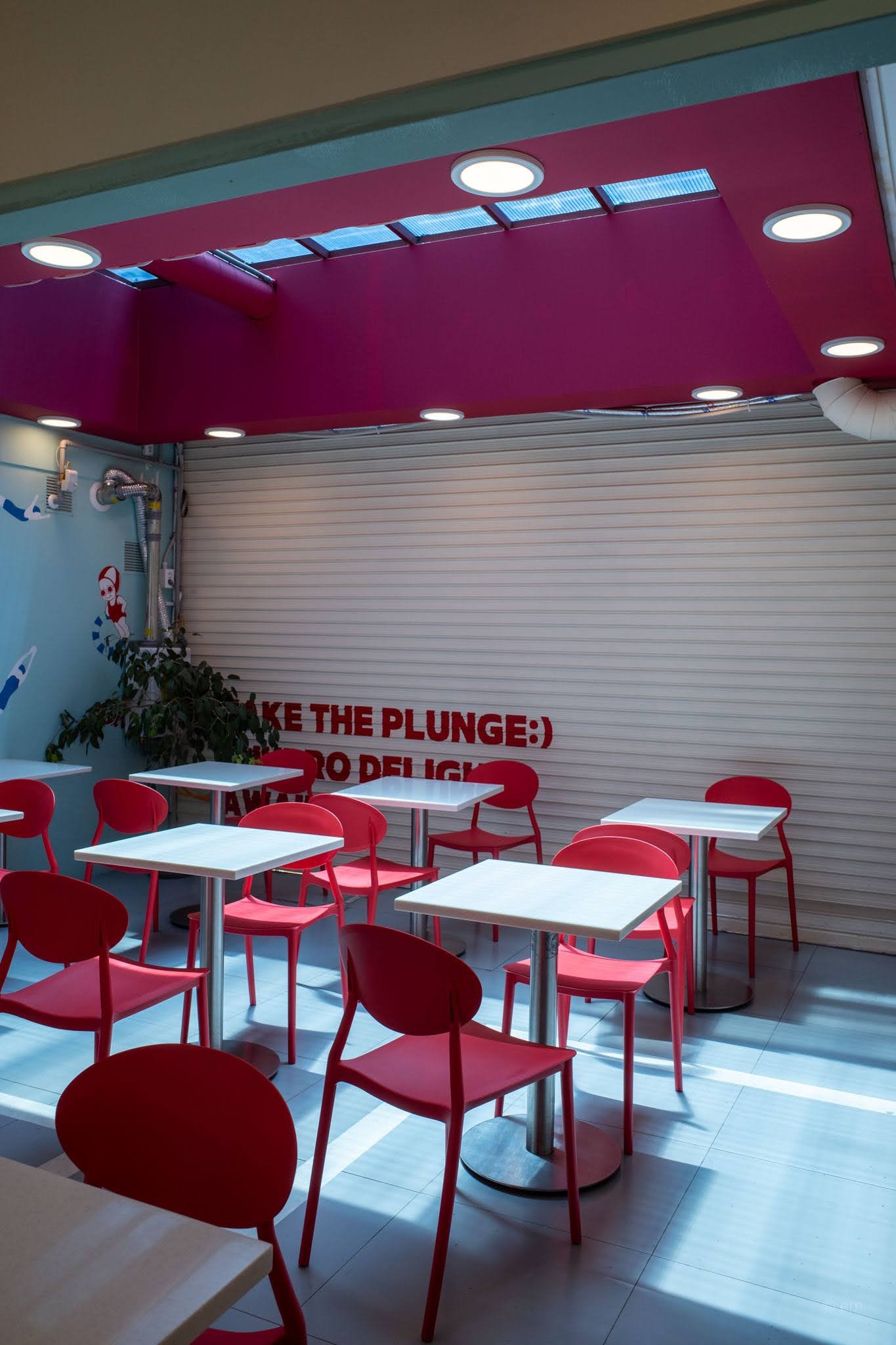
Further in still, another zone opened behind a rolled shutter, with a magenta-pink ceiling, white slatted walls, and a smattering of red chairs in various styles — slightly more casual, slightly less curated. A message across the shutter read: Take the Plunge 🙂 Go Deligh[t] — a sentence that ended just off-frame but made the point well enough.
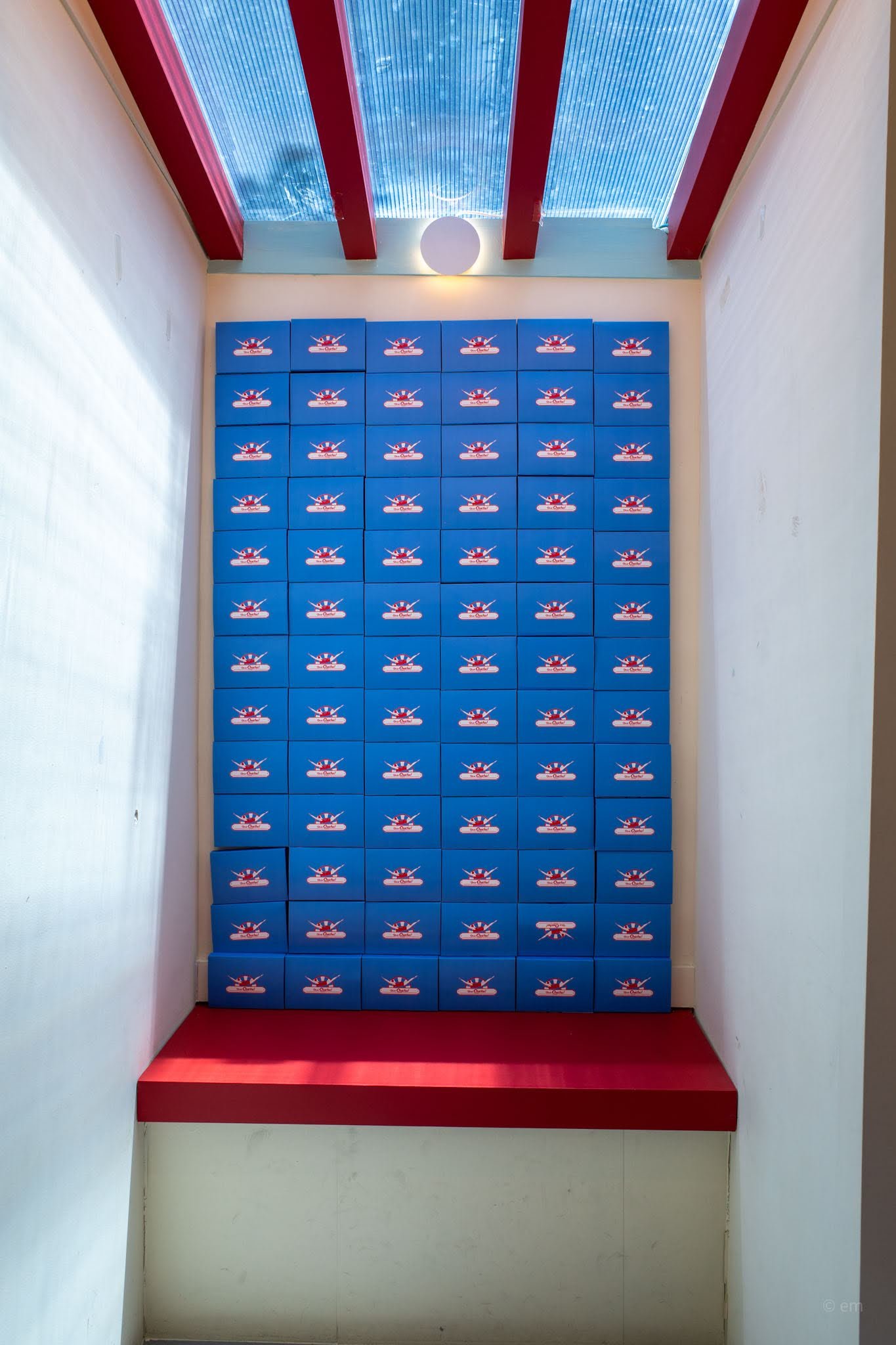
A compact alcove near the entrance housed an installation that was almost absurdly photogenic: a floor-to-ceiling wall of Diver Chu! branded blue packaging boxes, stacked perfectly in a grid, lit from above by a single round wall light. A red upholstered bench sat in front of it. Nothing else. It did not need anything else.
The Mascots
Diver Chu! ran a tight universe of illustrated characters. The main diver figure — sleek, graphic, vaguely mid-century moderne in her red swimsuit — was the serious one, the brand ambassador. But there were others.
Painted large on a column near the entrance was a different character: a round-faced woman wearing oversized circular swimming goggles and a red swim cap, rendered in a loose, expressive style against a chocolate-brown splash illustration. She looked slightly bewildered, endearing — the B-side mascot.
Elsewhere on the walls, a pair of chubby illustrated characters in swimwear and goggles appeared side by side, drawn in a rounder, more cartoonish register. And on the aqua-blue section of wall, a vintage-style character straight out of a 1960s American resort poster strutted alongside the words Churros.
The whole visual world of the place had been thought through with more care than most brands give their primary identity, let alone their secondary characters.
What It Was About
Diver Chu! was not just a churros shop with nice wallpaper. It was an argument — that a snack food could carry a complete aesthetic universe. That a café in Seongsu-dong could conjure a retro-Americana swimming carnival fantasy and make it feel genuinely Korean at the same time: the font choices, the pastel palette offset by that pop of candy red, the way the branding leaned into cheerful maximalism rather than the spare Scandinavian minimalism that dominated so many of its contemporaries.
The tagline “Take the Plunge” could be read as an invitation to eat a churro. It could also be read as the design philosophy of the whole place. They committed. Fully. No hedge, no ironic distance, no apology for being exactly what it was.
Found, Then Lost
Diver Chu! is gone now — at least from its Seongsu-dong address. Whether it relocated, rebranded, or simply closed, the result is the same: the marquee lights are off, and someone else will fill that storefront with something entirely different.
What remains are photographs. The diver still mid-air, the blue boxes still stacked floor to ceiling, the red chairs still catching that submarine skylight. A place that existed in complete tense, briefly, and then was over.
Some cafés are destinations. Some are passing trends. Some are genuinely good ideas executed with genuine talent that simply don’t survive the economics of the café industry in a city that eats concepts alive as fast as it invents them.
Diver Chu! was the third kind.
Visited: Seongsu-dong, Seoul. Now closed.


![[Lost] Califhouse, Dosan: A Beverly Hills Dream, Now Closed](https://hiddencollector.thesensitiveways.com/wp-content/uploads/2026/04/R0004011-2-200x300.jpg)
![[Lost] The Most Holy Pizza Ever: Pizzus Crust, Seochon](https://hiddencollector.thesensitiveways.com/wp-content/uploads/2026/03/R0004246e-300x200.jpg)
![[Lost] Hey, Laura!](https://hiddencollector.thesensitiveways.com/wp-content/uploads/2025/03/HEY-LAURA-200x300.png)
![[Lost] Maison de BaBa, Jeju: The Oasis That Vanished](https://hiddencollector.thesensitiveways.com/wp-content/uploads/2025/09/R0008305.jpg)